Banana Republic's Design Revolution
While many retailers are cutting back on store sizes, Banana Republic, a division of Gap Inc., is experimenting with emporium-sized stores—think more than 13,000 square feet—to show its new face.
The new Banana Republic concept, which the retailer calls its Revolution stores, came to South Coast Plaza in Costa Mesa, Calif., on Nov. 4. Banana Republic’s head of store design, Mark Nitkey, talked to California Apparel News Retail Editor Andrew Asch about the concept and the retailer’s ideas about design revolution. CAN: When did Banana Republic debut its Revolution store? How many will there be?
Mark Nitkey: We are still in test mode for this new concept. It is really a multi-year effort to arrive at the best prototype for new stores. Our Revolution store concept debuted at Fashion Show [mall] in Las Vegas in September 2009. That year, we also opened two additional test stores: one in Scottsdale Fashion Square, as well as our flagship location in SoHo, New York.
In 2010, we opened locations at South Coast Plaza in Costa Mesa, Calif.; Garden State Plaza in Paramus, N.J.; Hillsdale Shopping Center in San Mateo, Calif.; and Country Club Plaza in Kansas City, Mo.; and we will be opening in Metropolis at Metrotown in Burnaby, B.C., Canada (just outside of Vancouver) in November. We are still evaluating how many of these stores will open in 2011.CAN: What inspired the shops-in-shops and the wide aisles? What inspired the Community Plaza?
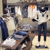
M.N.: The design intent of Revolution was to create a new physical environment that exemplifies the essence of the Banana Republic customer: “modern souls” that love discovery and have a sense of ease and confidence. The design manifested itself through multiple inspirations: There is our customers’ appetite for discovery. Our product—which is designed to fulfill the different parts of our customers’ lives from day to night, work to play—and how to best showcase this. Cities, both domestic and international—those that create excitement and a sense of community along narrow streets lined with shops, as well as public spaces such as plazas/piazzas. A residential scale, look and feel is important. Through these inspirations, we created a wide, central boulevard lined by shops that draw you inside with their own small “vitrine” storefront to communicate the product story. These intimate boutiques have a residential feel such as a walk-in closet. We then created a plaza as the “hub” of the store to accommodate our accessories assortments: shoes, handbags, jewelry and small leather goods.CAN: Do the SoHo or Las Vegas Revolution stores look exactly like the South Coast Plaza stores or do they have their individual looks?
M.N.: Our desire was to create an airy yet intimate interior with a modern mix of old and new, juxtaposing authentically styled ceilings and floors with contemporary cabinets, fixtures and displays. To accomplish this, we kept our material use to a minimum, using reconstituted walnut for our wood in cabinets, trim and fixtures; ceramic tile for our floors; and residential molding and detailing. Our storefront is limestone. The Banana Republic design team envisioned the clock as an iconic center of focus within the plaza. The flexibility of our Revolution design allows us to incorporate it into multiple configurations, locations and merchandise assortments. The South Coast Plaza location exhibits all of the design elements of the new concept that we hope to incorporate in future Revolution stores. Our flagship and street stores may take on a more unique look because of building and design constraints. SoHo, as a flagship, includes unique design elements such as the storefront, shop layouts, detailing, concrete floors, unique fixtures, art and displays. Though the application of detailing may differ, through the use of our wood materials and juxtaposition of new and old, the look and feel of each various location will be similar.CAN: Did Banana Republic designers develop the Revolution look? Were outside architects involved?
M.N.: It was truly a very close collaborative effort between our Banana Republic design team, our architect Gensler San Francisco (which worked on the SoHo Store) and McCall Design San Francisco (which worked on the other stores). The Banana Republic Design Team directed the concept and development work, defining the look and feel of the store based upon our brand guardrails. The team was also responsible for determining the size and configuration of the shops based upon merchandise needs; designing the cabinets, trim, fixtures and displays; and selecting materials, lighting and art while working directly with vendors to fabricate each item.CAN: How do you quantify the success of the Revolution concept? Has it increased sales? How so?
M.N.: Over our 30-year history, Banana Republic has become known not only for its fashion but also its store design and experience. We have been looking at multiple factors in evaluating the success of the new concept: enhancing the customer experience, creating clear, compelling product stories through elevated visual merchandising, increasing merchandise capacity and improving overall store sales performance. We have received positive feedback from customers to date, along with positive results in the other metrics, as well.


