Nordstrom's Revamped Website Is Less Catalog, More Social
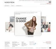
In the Web world, a hefty redesign can mean a welcome, refreshing change or a navigation headache. Fortunately, Nordstrom’s newly revamped website has emerged with a pared down, sleeker look that seems less catalog and more Polyvore. For shoppers, the e-commerce navigation is more direct in its jumping off points. (Choices being Brands and Departments to take you where you want to go.)
The site’s newest feature, called “The Conversation,” gets shoppers to stay and explore its social-network, where it houses “The Thread” blog, the “Eye for Style” behind-the-scenes section and “The Fashion Forum” for customers to sound off.


