Santa Monica Place Remodel Lets Sun Shine In
The Santa Monica Place retail center has not made use of its beautiful Southern California weather until now.
The retail center, located in Santa Monica, Calif., is in the midst of a $265 million remodel that is scheduled to be unveiled in August 2010. Macerich, the real estate investment trust that owns the property, let the sun shine in by tearing the roof off of the common area of the 560,000-square-foot mall. It also will reconfigure the place to be as pedestrian friendly as its architectural inspiration: the sunny, scenic plazas of Italy.
Influential architect Jon Jerde designed the look of the new Santa Monica Place. Jerde made his reputation in the late 1970s by remodeling the San Diego–based Horton Plaza retail center into a pedestrian district, which has successfully beckoned people back into the urban core.
Santa Monica Place is located two blocks away from the beach and adjacent to the high-profile retail district Third Street Promenade. The new Santa Monica Place will be the site of a 100,000-square-foot Bloomingdale’s and a 120,000-square-foot Nordstrom. Other retailers that signed on include Kitson, Michael Kors, Ted Baker, Bernini, BCBG Max Azria, Ed Hardy, Joe’s Jeans and True Religion.
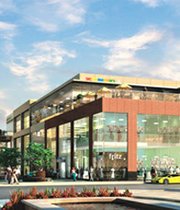
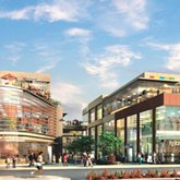
Some of the main features of the Santa Monica Place remodel will be a 16,000-square-foot center court where pedestrians can hang out and enjoy public art and a fountain, according to Bob Aptaker, vice president of development at Macerich. The retail center will be three levels high. Restaurants will serve hungry people on the third-level dining deck, which will offer ocean views and sights of the city of Santa Monica.
Pedestrian access to Santa Monica Place will be easy, according to Aptaker. There will be four big pedestrian entrances to the mall, each with a unique design that celebrates the immediate scene outside the mall. For example, the pavement closest to the beach side of the mall on the Second Street entrance will feature some shell fragments and be reminiscent of sand.
Much of the material used in the retail center will be concrete, terra cotta and glass, which is intended to give a classic, timeless feel to the retail center’s architecture. The western edge of the mall will feature a glass wall that will rise from the retail center’s first level to its third level. Santa Monica Place’s five elevators also will feature glass walls.
Santa Monica Place’s new sense of openness has received good marks from neighboring businesspeople. Many expect the retail center to attract more shoppers to Santa Monica’s other retail streets, said Anthony Schmitt, vice chair of the board of the Main Street Business Improvement Association. “If they’re on a [mall] balcony and they see a neighborhood [they have] never been to before, there’s more of a chance they’ll go there. It’s inviting,” he said.—Andrew Asch


