Taking Fashion to the Silver Screen
Audrey Hepburn once said: “If clothes make a man, then costumes make an actor.”
From fantastical period costumes to innovative contemporary designs, costume designers are more than just stylists. They’re artists, technicians, researchers and historians. They have the ability to help create a world of imagination or bring us back to significant moments in history.
Most people don’t know the work that goes into creating the entire wardrobe for a movie. But every year, Hollywood’s talented costume designers get the public spotlight by being recognized at the Academy Awards. In recent years, period pieces have frequently taken home the golden statuette: “Shakespeare in Love” (1998), “Gladiator” (2000), “Moulin Rouge” (2001), “Chicago” (2002) and “Memoirs of a Geisha” (2005).
Equally stylish and flashy classics from “Midnight Cowboy” (1969) and “Saturday Night Fever” (1977) to “Flashdance” (1983) used fashion as a commentary on the times while introducing new norms in fashion, but they didn’t take home any Oscars. But that could be about to change.
Two of this year’s nominees—“The Queen,” a contemporary film about the royal family following the death of Princess Diana, and “The Devil Wears Prada,” a fictional view of life in the fashion publishing world—are all the buzz for the Best Costume Design Academy Award.
California Apparel News recently spoke with four of the five Academy Award nominees for Best Costume Design in 2006. Milena Canonero, nominated for “Marie Antoinette,” was unavailable for an interview.
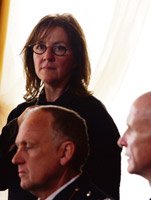
Consolata Boyle “The Queen”
A graduate of archaeology and history from the University College Dublin in Ireland, Consolata Boyle got her start as a set and costume designer at The Abbey Theatre in Dublin before landing costume-design gigs for the films “Widows Peak” (1994), “Moll Flanders” (1996), “The Winslow Boy” (1999) and “The Actors” (2003). Her knack for refreshing a story line with simple and elegant designs earned her an Emmy in 2004 for Andrei Konchalovsky’s TV remake of “The Lion in Winter.” Boyle is currently working on a film about Winston Churchill.
“The Queen” is a contemporary film that revolves around the reactions of the royal family to Diana’s death in August 1997 and the role of Britain’s newly elected Prime Minister Tony Blair in reconnecting the royal family to their people. The need for the modernization of the royal family is a theme throughout the film. How did you convey that using contemporary costume design?
The way I approached it was that these two worlds had a clash. The monarchy seemed arcane, out of touch, while the modern Blair had new energy and was in close connection to the people. The modern and the ancient were clashing. With Blair there was busy energy, a casual feeling about him and the feeling of the family. There was a warm, energetic buzz. And the contrast was a static world that Elizabeth inhabited with her royal household and not changing. Her feeling of responsibility and tradition was achieved in costume by getting the uniforms correct so the audience could feel the formality of it. At Balmoral [the Scottish home of the royal family], Elizabeth can breathe again, loving the countryside. It was a feeling of two worlds—the formality of the royal world and the new Labor government—colliding at that moment of time.
What was your approach to costume design for the film?
Paired back, simple and unfussy, so there’d be no distractions.
How many costumes did you design for the film?
We had eight weeks’ prep for the film, and we shot it in eight weeks. We designed 30 costumes from scratch. We wanted to be sure to capture all the nuances and details because it was a time in history that people remember—Diana’s death and the royal family’s response. We felt that if there were a false move with the wardrobe, it would break the audience’s concentration. All of the research was gathered together for costume design, including the royal household staff and the Blair household, so that the feeling and time of place were true.
In the film, we saw several sides of Elizabeth—the formal, the country girl and the grieving queen.
In London, there’s a much cooler, flatter, urban feel for both the queen and the Blairs. The queen is in work mode, as opposed to the relaxed, homey atmosphere at Balmoral. For her appointment attire, I wanted to create a feeling of majesty and formality from pale lilac to dark purple. The dress Helen Mirren wore in the first scene gave her a square figure. Besides being a queen, Elizabeth is a grandmother. We applied very minimal padding to Helen’s dress, slightly on the hips, waist and bust. For her countryside attire, she wears a warm earthy Beaufort jacket, Tartan skirts, Wellington boots and brogues, and everything that is practical and comfortable. I chose scarves and wools with soft, earthy colors such as greens, browns and golds with red going through it.
The men’s costumes were made from tailored pieces and original designs, including Prince Philip’s tweeds. I used strong Harris tweeds for the scene in which they go stalking after the deer. I chose this sort of fabric because it’s practical and thornproof. The queen’s black mourning dress is a two-piece. It was made with a light wool crepe fabric—slightly bloused over a belt with tie neck and long sleeves, and the skirt has wide box pleats. Many fashion designers design for her. For my inspiration, I chose British designer Hardy Amies, who designed beautifully simple silhouettes for her for a time. Sometimes she can wear very loud prints, but I avoided all of that. I just used solid color and shape.
Queen Elizabeth is one of the most identifiable people in the world. How did you re-create her look, and what are some staples in her wardrobe that stand out to you?
Watching hours and hours of archive footage [still and moving pictures] and studying her every move and piece of garment, including accessories. Her pearls are always the same size. Her country attire—Liberty scarves and Hermegrave;s scarves—are very iconic. All of that was matched and made. The jewelry was made from scratch, including her brooches. One is in the shape of a bow, with little white glass stones and diamonds. There’s the Catholic rose brooch—a circular, interwoven, multilayered diamond brooch. Her brooches are always worn on her shoulder.
Her spectacles took a lot of research. Now they’re smaller, but in 1997 they were large—almost as if she were hiding behind them. All of those things were matched directly with archive footage. Helen absorbed the role by using everything around her as props and made it look effortless. My hope was to create a wardrobe that allowed the audience to get close to the woman rather than come between them.
In one scene, Prime Minister Blair is wearing a soccer jersey. Was that your attempt to capture his lack of polish as a newcomer to power?
Yes. He was a young man with a young family, and I wanted to convey that feeling of him being in touch with the people.
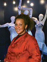
Sharen Davis “Dream Girls”
Louisiana native Sharen Davis is known for her urban/contemporary costume design in films such as “Akeelah and the Bee” and “The Pursuit of Happyness,” both in 2006. This is Davis’ second Academy Award nomination. (She was nominated two years ago for “Ray.”) Davis was interviewed when she was in Arizona, where she gave a lecture at a power summit for African-American women.
What was your design direction after you read the screenplay?
I was inspired by a variety of three-girl groups and solo acts from the 1960s. My costume designs for the 1970s scenes were a little more personal. Prior to costume designing, I was a vocalist for a number of years. So I was inspired by my own past. Aretha Franklin, Cher, Diana Ross and Dionne Warwick were a few of my favorites. But throughout the film I just kept saying to myself, “Let me live vicariously through this movie, please!” I didn’t have access to any of the original clothing worn by Motown artists, including Diana Ross. I am old enough to remember. I idolized Diana Ross, so I remember every silhouette she wore. I referenced photos from fashion magazines and catalogs such as Sears, J.C. Penney, Life, Ebony and whatever I thought could be valuable. I also watched archive footage from ’60s and ’70s variety shows such as “Shindig,” “Playboy After Dark” and “Hullabaloo.”
What was the design process for “Dream Girls”?
I met with the film’s director, Bill Condon, in April 2006 to get a concept of sets and lighting and direction to take with each song. I didn’t have much prep time because I was working on “The Pursuit of Happyness.” I had 10 weeks’ prep time. We really couldn’t start because we didn’t have Effie [played by Jennifer Hudson]. The director auditioned 700 girls for that role. And I was designing dresses not knowing what the size would be. I was illustrating blindly. So I put more focus on Eddie Murphy’s and Jamie Foxx’s characters. I also created a huge illustration board for Deena [Beyonceacute;’s character]. I focused on Effie’s costumes after Jennifer was cast in the film.
What were some of the challenges?
Designing one style dress for three different body types was a challenge. Designing dresses and suits with a contemporary look but [that] are durable enough for big dance numbers was another challenge.
Diana Ross, the Jackson 5 and Marvin Gaye not only influenced the racial integration of popular music but also fashion styles. There were quite a few defining looks in the film.
I felt that the costumes were a homage to the music and musical theater industries.
There were some [styles] that I remember well and tried to find scenes in the film that they would work well [in]. The song Eddie Murphy is recording in a scene during the early 1970s had such a Marvin Gaye sound. So I went for that look. [In that scene, Murphy wears a Western-style button-up shirt and knit cap similar to one worn by Marvin Gaye on the covercover of the “Let’s Get It On” album.] In addition to hairstyles, there were some classic Motown looks inspired by Diana Ross and The Supremes and the Jackson 5, among others. But there were also some costumes that were not inspired by Motown. For the song “Heavy, Heavy,” the leather miniskirts were inspired by Mary Quant in order to punctuate that the scene took place in the late 1960s.
In Hudson’s standout role as Effie, she wore a mixture of ethnic styles. From what standpoint did you create her character’s wardrobe?
Before filming began, I met with Jennifer Hudson to discuss her character’s arch. I told her that I liked classic looks for the ’60s Motown era, but in the ’70s I want you to go Afrocentric like Aretha Franklin during that era. I didn’t use so much African fabric. I just focused on caftan silhouettes and came up with fabric that could be modern, not outdated. I designed a few caftans. I designed a patchwork caftan with cut-out arm squares and paired it with an African head wrap. One of my favorites is a sleeveless gold caftan that is very fitted. That look was inspired more by Eryka Badu, but I had seen photos of Aretha wearing something very similar during the ’60s and ’70s.
Yee Chung Man “Curse of the Golden Flower”
Yee Chung Man worked as an art director on contemporary films for several years before his first epic film, “A Chinese Ghost Story” (1987). As a costume designer, his ideas are limitless. For “Curse of the Golden Flower,” he combines period and fantasy with a touch of decadence inspired by Technicolor epic films of the 1950s. This is Man’s first Academy Award nomination.
Have you always wanted to be a costume designer? When did you start working in motion pictures?
I was not fashion/costume design–oriented in education. I started off as an art director for movies in 1981. Later on, I found myself also being interested in costume designs. I made my first attempt to cross the border once the opportunity was offered.
Your previous work includes costume designs for contemporary films, including “So Close,” an action thriller. Did working on a showy period film such as “Curse of the Golden Flower” present any challenges?
The scale of the movie is comparatively big, and I have to achieve a look that is much different from the other movies set in the same period [the Tang Dynasty]. There are two main elements that make the look quite different from other Tangperiod films. First, we chose “gold” to be the dominant color for the entire movie. Second, the “more is more” style showing an overwhelmingly extravagant look is not often used by others.
What type of research did you do on the Tang Dynasty before you set out to create costumes?
References about costumes in the Tang Dynasty are few, and most of them are described in written words only. To achieve a unique style, I have to put in flavors from other sources such as fashion magazines or even classic movies [e.g., “Cleopatra” and “Camelot”]. I tried to apply a contemporary touch to the classical look as both superb movies did. I used different kinds of fashion rather than the traditional silk fabrics. [The robe worn under the armor was made in vinyl materials.] The colors I used are brighter than colors we see in murals and paintings of the Tang Dynasty. Modern-styled accessories were also used [e.g., the head ornament of the queen].
What type of historical facts did you discover about 10th-century fashion?
The Tang Dynasty is known to be the longest reign in Chinese history without wars and catastrophes. The affluent and civilized lifestyle led to a more open-minded culture.
Your costume designs most definitely reflected a new open-mindedness. For instance, this is the first period film I’ve ever seen where Asian women wear dresses that show their cleavage. They were extremely exquisite, I might add.
Cultural influences from the West and Middle East were brought in through the Silk Road. It was also the most daring period for women to show more of their bodies. We were asked to create a decadent, harem look for the movie. So we tried to design the low-cut gowns for the queen and the court ladies in a style similar to the court in 18th-century France. Showing the cleavage is uncommon for Chinese period films. As in the opening scene, the maids wore tight-fitted undergarments in very soft, silk fabrics. Showing more of their bodies set the tone.
Were there other influences in your costume designs that were not of that era? How did you work those details into the costume design? What was the reason you added those details?
I was asked by the director to design the costumes in a new approach with a “larger than life” style, and they shouldn’t be traditional and conventional. So the costumes were full of different kinds of design elements from countries such as Japan, Korea and the Western world. Any motif that was appropriate would be woven into the content.
The Dragon Robe and Phoenix gown took 40 artisans two months to construct. What types of fabrics did you use to make the costumes? Where did you source your fabrics?
Silk, satin and brocade from China, Hong Kong and Japan were used to make the costumes. Embroidery and sequins were also applied.
The armor you created for the film is intelligently designed from a historic standpoint but also fantastical from a creative point of view. Can you explain your interpretation?
The idea is actually a fusion of Chinese and Japanese traditional armor design. The style of Chinese armor is often simple and basic in shape while the Japanese armor is always elaborately and meticulously designed. I tried to apply more details and embellishments into the traditional Chinese armor and enhanced some motifs to make it look exaggerated [e.g., the helmet].
For the armor, different pieces of chromed copper plate were hammered against the mold with dragon motifs. They were stitched onto leather trimmed with brocade. All their leather segments were sewn together to become one piece. A clay mold for the helmet [with the dragon crouching on top] was made before it was done with real metal.
For the queen’s peony robe, hundreds of big and small pieces of embroidered peony [some with sequins and beads] overlapping one another were sewn together, according to the designed cutout.
For the king’s dragon robe, we first illustrated the dragon onto different cutouts. They were embroidered with different kinds of golden threads. Golden sequins in different shapes were finally sewn onto the robe to create a more vivid style.
To draw a design on paper is always easier than to construct it physically. To deviate from the traditional design is controversial. To make “heavyweight” armor wearable is a headache.
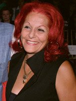
Patricia Field “The Devil Wears Prada”
Known for her sexy, over-the-top styling and fiery red hair, fashion stylist and designer Patricia Field made her mark on the fashion world as the costume designer for the hit HBOTV series “Sex and the City.” A fashion stylist and retailer, Field got her start in the entertainment industry when she designed costumes for the television series “Crime Story,” followed by the film “Miami Rhapsody.” This is Field’s first nomination for an Academy Award. She just completed the movie “Suburban Girl” with Sarah Michelle Gellar and Alec Baldwin.
How many costumes did you design for “The Devil Wears Prada”?
I didn’t design the “clothes.” I would say “style.” About 200 on principals and another 300 for extras who were in the office, at the fashion show and the photo shoot in Central Park.
Where did you source your styles?
Mostly from designers and some retail shops in New York City. There were only two vintage pieces in the film: a green coat with leopard-print collar made in the 1960s worn by Andy and the plaid three-piece suit made circa 1970 worn by Nigel. Unless you consider Donna Karan late 1980s vintage.
Like the film’s prolific fashion editor, Miranda, you too are known as a fashion forecaster because of your ability to spot hot trends and new talent. Was that your intention with this film—to stay ahead of the curve?
Never at any point was I trying to create any trends. Trends might have been created, but that was not my intention. My job is to read the script and meet the actors and devise the costumes and create the character. My inspiration comes from the script and the actors. So I never really had any conscious level of making trends or keeping up with them.
What was your design direction for the film?
I didn’t use too much low end on “The Devil Wears Prada,” because the script dictates the clothing you’re going to use. There was no place for little funky stuff. Meryl Streep’s Miranda was an accomplished career woman and had her personal style. I thought of her position as fashionmagazine royalty, so she should wear very expensive clothes. I wanted to make a play between royalty and career clothes.
I blended embroidered jackets by Bill Blass—something a queen would wear—with classic white shirts and pin-striped pencil skirts to give Miranda her own personal style. I used a lot of Donna Karan archives, Valentino, Prada and lots of fur coats. One of my favorite outfits Meryl wore is a purple dress from Donna Karan’s archives. I was going for silhouettes that were clean and flattering. The gown she wore for the scene at the museum party was made by Valentino for Meryl for the film. That’s where Donna Karan came in easyto- wear and clean.
And you have Andy Sachs, portrayed by Anne Hathaway, who got dressed from the closet—which means “world brands.” For Andy, I chose Chanel because Chanel wanted to work with me for her wardrobe, and I was very happy about that. I felt that Andy was a Chanel girl at heart.
The book “The Devil Wears Prada” was written by a former assistant to Vogue’s editor-in-chief, Anna Wintour.
I was dressing Meryl Streep—different body, different persona. I didn’t reference Anna because I felt that 2 percent of the audience would know who she was. In other words, I don’t think 98 percent of them were referencing Anna Wintour. For them, it was a movie about the fashion world. There is a much bigger audience in movies than books—nothing against books.
There’s a scene in the film where Miranda chastises Andy for not knowing the difference between “blue” and “cerulean.” In the midst of this discussion, she pairs some pieces of clothing and demonstrates her natural trendmaking ability.
I suppose it is like that with the real fashion world. We took a tulle dress and said, “Let’s believe it’s Christian Lacroix.” We created that look and feeling. It was kind of a little game I played. It wasn’t anything much. I said, “Let’s take this dress and build it up and call it Christian Lacroix,” and with the belt, “Let’s add another element of color to it.” That’s Christian Lacroix. He uses colors like a madman. He’s not restrained in any of his work, not in his color or his silhouettes. It’s his signature. So I was making a little homage to Christian Lacroix. It’s the nature of what I do. I have references in my mind, and that’s what gives me a hook.
You must be a huge fan of fashion.
I’m a fan of anything intelligent and brilliant.


