Build Like an Architect, Sell Like a Retailer
Architects and designers build stores by balancing visionary architecture and merchandise
What was Prada thinking?
Celebrity architect Rem Koolhaas designed the Italian luxury-goods maker’s Beverly Hills flagship, which opened on July 16, with a street level that has no storefront, no glass and no walls.
It is one of the most memorable buildings in Los Angeles, and that distinction may give Prada the competitive edge, according to Russell Sway. He’s the president of the Institute of Store Planners, a Tarrytown, N.Y.–based international organization of designers and architects who specialize in building boutiques.
“It’s the idea of a branded environment. It’s a unique environment promoting sales and enhancing the image,” Sway said about retailers building spaces that consumers will associate with the stores’ products.
Retailers spend more than $6 billion annually designing stores that will lure consumers and make them return, he said.
This design specialty increasingly requires juggling the architectural vision of a Frank Lloyd Wright personality, the sales savvy of a Madison Avenue advertising firm and the empathy of a best friend, said Shaheen Sadeghi, chief executive officer of The Lab and The Camp, two Costa Mesa, Calif.–based shopping malls renowned for their rock ’n’ roll and organic designs.
“The practical side of the design is important,” Sadeghi said. “It’s not just about creating an outrageously designed store. It’s not about being the coolest. It’s got to do with making people feel good.”
Getting this balance right is a unique art. Since 1999, the Institute for Store Planners has been awarding prizes to those able to satisfy the sometimes opposing goals of looking unique, making people comfortable and selling merchandise.
But few of the prize winners are in California. Dennis Takeda, president of the Los Angeles chapter of the Institute of Store Planners, blames this shortcoming on an embarrassment of riches: California is already crowded with great stores.
“The awards seem to be won by foreign retailing,” Takeda said. “They seem to be investing more in building stores, and they’re tweaking concepts. It’s pretty saturated here, and if you’re not building new stores, you’re not going to be winning awards.”
The Institute of Store Planners has lauded California-based apparel stores in the past, however. Former honorees include:
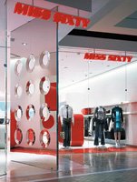
bull; The Miss Sixty store in the Costa Mesa, Calif.–based South Coast Plaza won a prize in 2002. The shop was designed by Giorgio Borruso & Associates of Venice, Calif.
bull; Anthropologie in Los Angeles–based shopping center The Grove won in 2001. The store was designed by New York–based Pompei A.D. LLC.
Since winning the award, the fortunes of Giorgio Borruso have skyrocketed. Borruso built four more Miss Sixty stores in the United States and designed the South Coast Plaza Paul Frank store, the first of that company’s boutiques not crafted by founder Paul Frank.
Borruso also built the new Fornarina store, a futuristic 2,350-square-foot store with a clear glass exterior, in Las Vegas’ Mandalay Place. The shop debuted this year, and the Italian footwear and apparel company, whose U.S. headquarters are in Los Angeles, is already adapting Borruso’s designs to its New York and Rome stores.
The Sicilian-born architect started his career doing interior design and building houses, hotels and restaurants in Germany and Spain. He taught at the University of California, Los Angeles and consulted three years ago. Borruso’s retail career started when Mark Wiltzer, president of Miss Sixty USA, tapped him to build a “Barbarella”-style 1970s shrine to the Italian jeans brand after seeing some of the designer’s European work.
“The contractor wanted to kill me a few times,” Borruso said of the detailed, envelope- pushing work he performed to adhere to his artistic vision for the $800,000 store. But he managed to accommodate the demands he and the company had for the store: The shop is visually arresting, and it sells clothes.
The first thing people notice about the 3,400-square-foot store is the giant, 100- pound stainless-steel door, visible from the pedestrian bridge outside the mall. While the doors are meant to pique people’s interest, the bright, futuristic red, white and steel surfaces and fixtures are intended to beckon them inside.
Borruso said the unique shapes and structures in the store lead consumers to the rolling racks of Miss Sixty denim. The areas around the merchandise are neutrally colored to attract attention to the apparel.
The architect also created drama in the back of the store, particularly through the dressing-room cocoons covered by opaque white spandex that reveal silhouettes of the people inside.
“I was a little afraid,” Borruso said of the risqueacute; dressing rooms. “I didn’t know if the public was ready for it.” Ready or not, they all came to catch a glimpse.
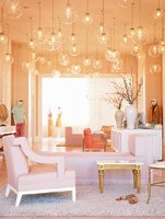
Los Angeles–based Trina Turk, which opened in late 2003 on West Third Street, is another store that uses unique architectural design to sell clothes.
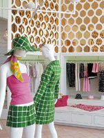
The ceiling, covered by 80 large globe-shaped light fixtures that give a party atmosphere, beckons customers into the store. Once inside, shoppers stay for the dramatic presentation of the clothes. Eighty percent of the boutique’s clothing hangs in recesses placed in the walls. According to Turk, the store’s different design guides people from alcove to alcove.
“It creates a cohesive merchandising,” Turk said. “Each one of the alcoves becomes a vignette or a story.”


