Display's the Thing
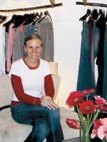
When Erica Berge opened her first store, Erica Dee in Corona del Mar, Calif., two and a half years ago, she spent $100,000 on visual displays. The amount included the flat fee of $7,500 she paid to Quiksilver merchandiser Roger Russell.
For Berge, the old adage rang true: You need to spend money to make money.
Through numerous meetings, Berge relayed her vision of the trend-driven women’s boutique situated on Pacific Coast Highway, and Russell went about realizing her vision.
“And when it came to materials, I got the best of the best,” she says.
The result is a store that combines stark modernism with innovative, natural fixtures. Clothing hangs from tree branches suspended by ropes. Tree stumps hold folded T-shirts. Custom- made cubes and walnut fixtures also hold folded apparel. And frosted glass and a concrete floor round out the “minimalist- but-feminine” deacute;cor that has been a huge hit with customers.
According to Berge, the money was well-spent.
“The store is very profitable,” says Berge, who already has plans for another.
Getting advice
Not all new retailers will go to the expense Berge did. Barry Rosenberg recommends they seek professional assistance before attempting to outfit a store themselves.
“Frankly, they have no idea what does and doesn’t work,” says Rosenberg, chief executive officer of Econoco, a 78-yearold store-fixture company in Hicksville, N.Y., that also owns Mondo Mannequins.
New retailers should hire a store-planning consultant, advises Rosenberg. Far more than an interior-design consultant, a store planner will help determine things such as the optimum position for a cash register and how traffic should flow through a store.
“It’s the same idea as putting milk in the back of a grocery store so you have to walk through the entire store [to get to it],” he said. “It’s a simple concept, but 99 percent of people aren’t going to realize it.”
Rosenberg also suggests retailers:
bull; Pay attention to lighting. A simple thing like lighting is critical. This includes endless variations of ambient and spot lighting.
bull; Create “sight lines” that allow a customer to enter a store and easily understand how to navigate it. A large decorative display that impedes the ability to see the boundaries of the store is a sure way to confuse and annoy a new customer. The shopper needs an understanding of what the store offers, and if they can’t see, you will lose them before they get to the back of the store.
bull; Establish a “decompression zone” that allows shoppers to get their bearings when they enter a store. Sales racks and signs displayed right by the front door are almost guaranteed not to be seen as a customer enters.
bull; Don’t hide cashmere sweaters in a glass case, no matter how well-polished it is. “Apparel needs to be touch-friendly,” Rosenberg says. “Studies suggest that if you touch a garment, you are 60 percent more likely to buy it.”
Go for the drama
Retail sales are a form of performance, and outfitting a store is like creating a production that requires a dramatic and effective set. The set dressing, or visual display, includes everything from hangers, mannequins and store fixtures to floor layout and even musical choice—everything that facilitates the shopping experience for the customer and ensures a long, successful run for the retailer.
Industry executives note that the key to success is creating a little drama—provided it relates to the merchandise carried in the store.
“It’s not like selling a washer and dryer—you’re in show business,” says Norman Glazer, president and chief executive officer of Patina-V, a visual merchandising company based in City of Industry, Calif.
Too many stores not only carry the same product, Glazer says, but also look the same. Setting a store apart with unique visuals is a key ingredient to success.
But first you must identify your customer—with as much detail as possible. “Once you establish that, then you’ll have an idea about how you want your store to look,” Glazer says.
For example, if you’re catering to the juniors contemporary market, your customer isn’t likely to respond to somber oaken deacute;cor suggesting a 19th century gentleman’s club. “If the merchandise is exciting, it should be accompanied by some sort of excitement within the store, either generated through music or visuals,” explains Glazer.
Glazer recommends that once you establish a look for your store, you stick with it, adding only minor changes over time.
Glazer cites Victoria’s Secret’s new store in the Topanga Mall in the Topanga Canyon section of Los Angeles as a superb achievement in visual merchandising. It is a replica of the company’s flagship store on 34th Street in New York, and the store’s graphics, mannequins and merchandise all work together to present one cohesive impression.
Retailers should also generate interest from outside the store, through signs and window displays that invite a customer to step inside—though you need not go as far as 1960s London boutique Granny Takes a Trip, which featured the front end of a ’47 Dodge protruding from its window.
Glazer recommends that you figure out what will draw the customer to your store and away from the other retailers in the area. For him, part of that draw is the mannequins that display the merchandise. But, he says, when it comes to mannequins, most retailers are “penny-wise and dollar-foolish.” Minding the old axiom that you get what you pay for, he says an inexpensive mannequin will not display clothing as well as a quality one. Patina-V’s life-like mannequins can cost up to $900. If you choose realistic mannequins, Glazer recommends they reflect the ethnic makeup of your customer base.
Retailing is as much science as it is show business.
There are plenty of resources—and consultants— out there waiting to assist fledgling retailers. “Millions of hours of analysis have been done and thousands of books written on what works and what doesn’t,” says Enoco’s Rosenberg. “Why invest in a retail store if you haven’t done the homework?”


